For this card you should work with a page that contains a main element with three elements inside, one article and two aside. Go ahead and create these first if you need to. If you want to work with my website, add the aside code from the previous Sushi Card onto the Attractions page. Here are three different page layouts you'll be applying:
Add new CSS classes to main and each of three elements inside it.
     <main class="attPageLayoutGrid">
         <article class="attGridArticle">
             <!--other stuff here-->
         </article>
         <aside class="attGridAside1">
             <!--other stuff here-->
         </aside>
         <aside class="attGridAside1">
             <!--other stuff here-->
         </aside>
     </main>
The container you'll change the layout of is main, but you could do this with any kind of container, like a div or article, or even the whole page body. The technique you're going to use is called CSS grid.
- In this example the header and footer will be left out of the design, but it's quite common to include them in the grid too.
Set the display property to grid on the overall container:
     .attPageLayoutGrid {
         display: grid;
         grid-column-gap: 0.5em;
         grid-row-gap: 1em;
     }
What do you think the grid-column-gap and grid-row-gap properties do?
Next, you name a grid-area for each element:
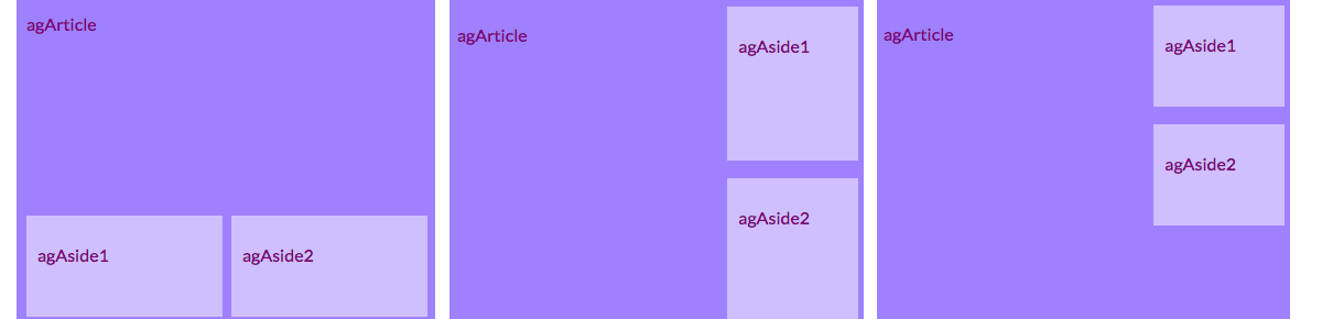
     .attGridArticle {
         grid-area: agArticle;
     }
     .attGridAside1 {
         grid-area: agAside1;
     }
     .attGridAside2 {
         grid-area: agAside2;
     }
Then you design your layout! Let's put the two aside elements side by side at the bottom. For this you need two columns of equal width. You can keep the row height automatic. Put the following code inside the .attPageLayoutGrid CSS rules:
     grid-template-rows: auto;
     grid-template-columns: 1fr 1fr;
     grid-template-areas:
         "agArticle agArticle"
         "agAside1 agAside2";
fr stands for fraction. Notice how you make the article take up all the space over the two columns.
Let's try putting the aside elements over on the right, and making them half the width of the article. Change the values of grid-template-columns and grid-template-areas to:
     grid-template-columns: 2fr 1fr;
     grid-template-areas:
         "agArticle agAside1"
         "agArticle agAside2";
If you don't want the aside elements to stretch all the way to the bottom, you can add a blank space using a dot:
grid-template-areas: "agArticle agAside1" "agArticle agAside2" "agArticle . ";- With CSS grid you can make almost any layout you like. If you want to learn more, go to dojo.soy/html3-css-grid
ADVANCED HTML
Design cool page layouts
I'm learning: HTML